Fun with numbers. Here are some hypotheses and testing with actual data. In fact the data that most sceptics prefer, good ol' University of Alabama in Huntsville.
Hypothesis (1) : Warming due to CO
2 is approximated as 3 times the log of the ratio of carbon dioxide levels.
Hypothesis (2) : Temperatures in
2008 have returned to 1983 values. Problem: (a) 1983 has a nasty little peak in it thanks to an el nino and PDO positive; potential cherry picking accusations. (b) 2008 has an anomalous drop thanks to la nina, PDO cooling and a solar minimum; potential cherry picking accusations. (c) Even if true, has little/no meaning as these are global temperature instances and not trends.
Using carbon level data from
Carbonify we have:
CO
2 in 1983 = 341ppm
CO
2 in 2008 = 384ppm
Increase = 3 x ln(384/341) = 0.37C
Using the data from
UAH we get the graph below (note the 12 month mean smoothing). The simple regression line shows a 0.42C increase. Hypothesis (1) has done very well. Yay IPCC.
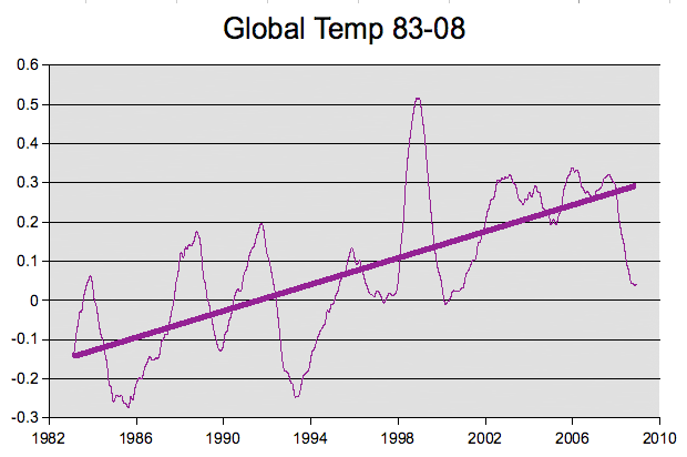
Hypothesis (2) somewhat true but technically inaccurate. The top of the peak in 1983 does seem to be at a level with the bottom of the drop at the end of 2008. However the average temperature increase in 2008 is 0.11 and in 1983 is -0.02. So using year is somewhat disingenuous and the hypothesis should be restated to the minimums of three months in 2008 were below the maximum month of 1983. Apart from a nice sounding factoid this actually demonstrates nothing about climate change. In fact this should be exceedingly worrying, 1983 with el nino and heating PDO can only get to the minimum of 2008 with a la nina, cooling PDO and solar minimum.
Hypothesis (3) : There has been cooling since 1998. Problem: (a) That's a very short time to find climate change effects. (b) 1998 was an exceedingly warm year thanks to el nino and a warming PDO; potential cherry picking accusations. (c) 2008 is affected by la nina, PDO cooling and solar minimum which should easily overshadow the minuscule rise in temperature attributed to carbon dioxide over this short time period.
Use the same data, fit a regression line. Oh dear, hypothesis (3) fails. There is actually a slight increase (obviously not statistically significant given the obvious climatic variation, you will want a longer time period to identify a trend). VERY worrying given the conditions of 2008, a cooling PDO and a low solar output - we should have cooling but do not!

All of these experiments are easily repeatable with the
UAH data and a little spreadsheet skill. Usually simple linear regression lines are a click away. Alternatively you can use the SLOPE() function.
An even quicker way is to use
WoodForTrees site to do it all for you. Check the 30 year trend from
1979 to 2009. On this site you can play with multiple temperature data sets as well as graph the total solar irradiance, the PDO, sunspots, CO
2 levels and so on. Check out the lower PDO and TSI in the last decade of the
1979-2009 year trend: PDO down, TSI way down, however temperatures remain steady/increasing.
Pacific decadal oscillation
PDO,
PDO data
Southern Oscillation
El nino / La nina
Solar cycle
Solar minimum / maximum
For data on
PDO, la nina, el nino and
Solar cycle years.
These are very simple data to graph constructions. There are no other factors or alterations of that data over and above what UAH may have done. If anyone can see where I am going wrong please feel free to point it out with clear precise instructions on what algorithms will improve it or what I may be failing to take into account. Opinion and belief need not apply.
More Data
The following is a list of data of various types from various sources for anyone who fancies playing with the numbers themselves.
Temperature data UAH
Here
Temperate data (etc) GISS
Here
Temperature data RSS
Here
Temperature data CRU
Here
PDO data JISAO
Here
TSI data NOAA
Here
TSI data NASA
Here
TSI data Max Planck
Here
CO2 data Siple Station Ice Core
Here
CO2 data Mauna Loa
Here
GHCN raw data
Here
USHCN raw data
Here
UCAR raw data
Here
Antarctic data:
Here
European ECA raw (and gridded) data:
Here
Italian Meterological Association's raw data
Here
Satellite data (raw and otherwise, including solar irradiance)
Here,
Here,
Here
The tide gauge raw data:
Here
World glacier raw data:
Here
ARGO (floats) data:
Here
ICOADS:
Here
Aerosol information:
Here
More paleoclimate raw data:
Here,
Here,
Here,
Here,
Here
Mann's data (for his first reconstruction) is available both on his site and at Nature:
Here,
Here,
Here
NOAA global temperatures
Here
Breaking (2009-Jan-22)
I just went back to the source data at UAH to see if the final month for 2008 had been added. The data has changed format, and the values have largely been changed from the original data set that I had downloaded. I am currently trying to find the source of the sudden vast changes to the UAH LT values but there is little information other than they are integrating in new satellite information with their current data. Frankly if their data is so unreliable that it changes by +/- 0.2C then I don't know how any credible research can be presented using these values.


